So I recently got a 13″ Macbook Pro and after month with it as my full time operating system, here are my issues with the Mac OS X as a heavily keyboard dependent user who has been in a Windows and Linux (Ubuntu/Debian) world for many years.
Command + Tab Application Switcher
One of the things apparent to me when I used a Mac previously was that when you Command + Tab (Mac’s version of Window’s Alt+Tab) to switch between open applications, it won’t show all the current windows open, just the applications. So, for instance, if you have 3 Finder windows open, when I Command + Tab I will only see one icon as show below.
3 Finder windows, 1 Finder icon in the application switcher

I can see the rationale for this as it doesn’t clutter the application switcher screen but I personally do not like it. There is a way to switch between multiple windows of the same program (Alt + `)(Command + `) which is good that it is accessible but still the inconvenience of having to switch to the application before switching to the right window. This is detrimental to my workflow and productivity on a Mac. I guess to combat this, expose was created for window selection. Expose nicely lays out all open windows on one screen for the user to select and bring to the foreground, and it is even keyboard accessible. However it is not as efficient as alt+tabbing on Windows because each time expose launches, you would have to search for the correct window on the screen before clicking it and proceeding. Witch solves this problem but it will cost you (€9.95) and I’m actually surprised at how few people want this option (current score is: -21).
Expose in action on 3 Finder windows:

Finder
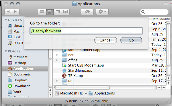
Finder is the equivalent to Window’s Explorer used for file management. One thing that became apparent to me when moving between OS’s is that OS X likes to create hidden files on USB drives and these files are never show in Finder. You simply can’t show hidden files in Finder. I also like to go to the folders by typing in the location using the address bar in Windows. This is something I also cannot do easily with Finder: the “Go To Folder…” dialog box has no auto complete and just does not offer the flexibility of a address bar where I can type and search on the fly.
OS X’s “Go to the folder” dialog instead of an address bar

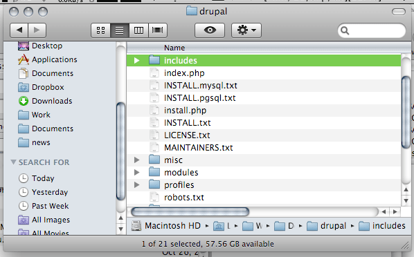
In Finder you cannot list directories first. Thus if you’re trying to access a folder that is deep in your folder hierarchy, you are just searching the sub directories of a folder, you will find yourself searching for the folder among the files. There really needs to be an option for this.
Folders sorted together with files instead of before

Cut and Paste
No copy and paste but cut and paste. Yes there is cut and paste in a text editor but there is none for file management in Finder. This is a big deal for me as I will use cut and paste very heavily in file management as it allows me to do all my file management via the keyboard. With Finder you’re forced to use the mouse to move files by dragging the folders into the necessary location. This ends up to be a huge time waster. It seems some 3rd party file managers (Path Finder and RAGE Macintosh Explorer) do implement cut and paste feature but if you cut files and forget to paste them (or you interrupt your cut with a copy and paste elsewhere) you can lose the files you previously cut. Windows and Linux has had cut & paste for years and here is Mac OS X without it. I find that hard to believe and also that only now in Snow Leopard you can restore your (accidentally) deleted file to the original location.
Replace not Merge
Take note that if you have 2 folders (A and B) of the same name and try to replace one folder with the other (drag folder A to folder B’s enclosing folder) do take note that it will replace folder B with folder A and not merge the 2 folders into one. Thus any files in folder B will be lost. This is very important and I can forsee a lot of cursing and swearing if this concept is not understood. For the record Windows merges the 2 folders giving the user with a folder containing files from both of the folders.

Menu Bar
So on a Mac the Menu Bar is always on the top and menu items change dynamically based on which application is currently in focus. The problem here is that you have to select the application first before being able to access any menu. So if you have another application window besides the current window you are using you cannot just access the menu item of the other window, you will have to click on the other window, move your mouse back up to the top of the screen where the menu bar is and file the item. Another time waster. You also cannot navigate menu items like you can in Windows. In Windows you can simply press the Alt key and menu bar is selected and thus you can use the navigation keys to move around the menu. Quick and simple. You can even use shortcuts to access menu items by pressing the key for the letter underlined in the menu. While you can place focus on the Menu bar in OS X using an awkward shortcut of Ctrl + F2 (am trying to find a way to mimic the single button Alt keypress in Windows) , there is no possible quick navigation of the menus.
On the right side of the menu bar there are icons/text that act as shortcuts to certain fuctions (e.g. wireless, bluetooth, volume control) or just for information display. The problem is that some programs have enough menu items to hide some of these icons and there is no way to view these icons in the hidden state. The only way around this is to remove functionality/information from the menu bar itself, preventing me from using it the way I want to. Windows has a feature to hide system tray icons and there is a toggle button to show them all. OS X needs a feature like this.
Menu bar in Mail – hiding some icons

Menu bar in Finder – revealing hidden icons

Window Menu
In Windows you can access the window menu by pressing Alt + Space. You can do things like maximize, minimize, restore and close the current window. You can even resize and move the window just by using the keyboard. That is just great and helps productivity. For OS X there is no window menu. You have to use the mouse to move and resize the window. Worse yet you can only resize the window my using the resizer in the bottom right of the window; you can’t resize from any other corner, ONLY the bottom right. I found that Afloat allows moving and resizing windows via the mouse as well as “always on top” and transparency features that I get with Compiz in Linux.
Zoom / (Smart) Maximize
In Windows the title bar has 3 buttons: minimize, maximize and close. In OS X you also have 3 buttons (on the left rather than the right), close, minimize to dock (-) button and zoom (+) button. Zoom does a ‘smart’ maximize that maximizes the window to occupy the optimal space, not the full screen. I can see that makes sense because when you maximize windows sometimes you get a lot of whitespace or useless space, but the issue with this is that it is inconsistent between applications and gets frustrating at times. So I found RightZoom that makes the Zoom button do a maximize like Windows and better still adds a shortcut to this.
OS X’s zoom button: love it or hate it

Home and End
If you work with any kind of text in Windows I believe the Home and End buttons are your friends as they are mine. It seems these friends have had a change of heart in the Mac world. I’m using a standard (Windows) keyboard with and when I press the Home / End buttons they bring me to the start / end of the document I’m editing instead of the start / end of the line that I’m used to. I know there is the Command + Left / Command + Right to do this but call me lazy if I think an extra button to press too much inconvenience. Thankfully I found DoubleCommand which allows the Home and End keys to work as I expect them to.
Inaccessible window/dialog box that float on top
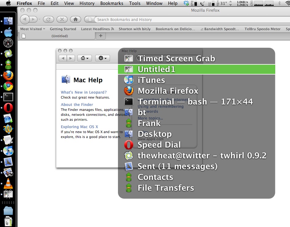
I found that there are some windows/dialog boxes that cannot be accessed via the keyboard application switcher (Command + Tab) or window switcher (Command + `). Open TextEdit (though I think it works in all applications), in the Menu bar > Help > TextEdit help. The window that appears is now inaccessible by the standard keyboard window selector shortcuts mentioned but can be accessed via expose. The worst part is that the window floats on top of everything you’re doing forcing me to reach for the mouse or find the window in expose. This can also happen if a samba share goes offline and you have it mounted
Mac Help window inaccessible via Witch (which is supposed to show all opened windows)

Keyboard inaccessible dialog box / help window

Conclusion
These are my main issues with OS X and there are several other (minor) issues. As you can see there seems to be people with similar situations to mine as there are 3rd party applications developed to overcome these issues. After using a Mac I have realized that Macs jeopardize (my) keyboard skill portability due to the use of the command key instead of ctrl key for many functions and also due to the fact that Apple keyboards have a different layout. I guess the same can be said for long time Mac users in the Windows / Linux world but the fact that Apple not only dictates OS X’s the software but the Apple hardware and both ‘offend’ my quest for keyboard shortcut portability. Just as how Opera changed their new tab shortcut to Ctrl + T from Ctrl + N many version ago for consistency among the other tabbed browsers I can only hope and dream that Apple would give an option to make OS X shortcuts work like they do in Windows.

